Bruce Schneier | |||||||||||
Schneier on SecurityA blog covering security and security technology. « Radio Interview | Main | James Fallows on the Chinese Cyber Threat » February 14, 2010TSA Logo Contest FinalistsLast month I announced a contest to redesign the TSA logo. Here are the finalists. Clicking on them will bring up a larger, and easier to read, version.
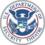
 Vote in the comments. The winner will receive a copy of our most recent books, a fake boarding pass on any flight for any date, and an empty 12-ounce bottle labeled "saline" that you can refill and get through any TSA security checkpoint. Voting will close at noon PST on Sunday, February 21. EDITED TO ADD (2/22): Winner here. Posted on February 14, 2010 at 3:28 PM • 440 Comments To receive these entries once a month by e-mail, sign up for the Crypto-Gram Newsletter. Daniel • February 14, 2010 3:52 PM I like the fifth too but I just finished reading about Operation 'Cyber Shockwave' and the phrase Security Theater is very much on my mind. So I'm going with #3. Sean Riley • February 14, 2010 3:54 PM Definitely number three. It looks official at a first glance. :) James • February 14, 2010 3:55 PM I'd have to go with the Department of Security Theatre as well. It's clean, snappy and wasy to understand. Everything a logo should be. And it gets the point across to boot. ;) Mike • February 14, 2010 4:02 PM Will Imholte (#2) The logo is original yet attractive and the security theatre bit is more implied & subtle. Donald • February 14, 2010 4:03 PM I have to vote for the second one, it has the three-word motto and it has the mask symbols to represent "security theatre" -- it packs the most meaning into one symbol and looks good doing it. Alex Martelli • February 14, 2010 4:06 PM Kurushio (#4). Not the best graphics, but BY FAR the best and subtlest message. Chris Granade • February 14, 2010 4:08 PM I rather like Gibson's one, as it makes the security theatre term take front stage, and as it looks most like a logo that would actually get used. Daniel D • February 14, 2010 4:15 PM I vote for the fifth "I love to fly and it shows". Simply brilliant on the 'I see Paris, I see France' :) monkey think, monkey vote • February 14, 2010 4:17 PM I vote for McHale (#1). I like the emphasis on the motto and the clear graphics. MathFox • February 14, 2010 4:17 PM I love Kurushio's version for the subversive message that the TSA takes liberties away. jonathan • February 14, 2010 4:17 PM Kurushio (#4). The subtle message draws attention to the true cost of security theater. B. Real • February 14, 2010 4:18 PM Wow, hard choices: #5: I love to fly and it shows (Close runner ups for me are #2 and #4) shadowfirebird • February 14, 2010 4:23 PM Kurishio. The others aren't satirical enough for me. This one just strikes the right tone. Alistair McDonald • February 14, 2010 4:32 PM I vote for "Department of Security Theatre " I'm not an American citizen; in fact I think I have a brain - does my vote still count ? ? ? Markus • February 14, 2010 4:35 PM The Departement of Security Theatre is just too good. It looks so genuine too. I'm sure with an official paper with its letterhead you'll get through any TSA checkpoint with your bag of weapons of mass destruction ! Eric Case • February 14, 2010 4:38 PM Kurushio's! It needs a little help from Illustrator but very nice symbology. Calum • February 14, 2010 4:41 PM Split between #1 and #3, but I think I'd plump for #3. All good though. Carl "SAI" Mitchell • February 14, 2010 4:49 PM I also have to vote for #3. While 5 is excellent 3 looks more realistic. Todd • February 14, 2010 4:50 PM I vote for Will Imholte's design: the masks of theatre, the silhouette depicting the dependency of opacity backed up only by symbolism. It all sums up what seems wrong with the TSA's approach. Morgan • February 14, 2010 5:13 PM I vote for #3. The U.S. Department of Security Theatre as well. Nicely done. Bruce • February 14, 2010 5:16 PM I like both one and two, but vote has to go to #2, the subtle play on security theater is great. Stacie H. • February 14, 2010 5:16 PM winner: Rhys Gibson Runner up: I love to fly and it shows
a. • February 14, 2010 5:18 PM I love "I love to fly and it shows" for the idea. EscapedWestOfTheBigMuddy • February 14, 2010 5:30 PM All good, but Rhys Gibson's is the best. Honorable mention for Travis McHale and Kurushio who also got the feel of these things right. Paul • February 14, 2010 5:34 PM #3 (Rhys Gibson) & #4 (Kurushio) do it for me. I love the irony in taking away the Statue of Liberty's lamp. Andrew • February 14, 2010 5:36 PM Dept. of Security Theatre by Rhys Gibson, non US spelling for the win Trichinosis USA • February 14, 2010 5:36 PM Ultimately have to go with I love to fly and it shows. Kurushio gets runner up. Chasmosaur • February 14, 2010 5:36 PM Rhys Gibson, Department of Security Theater. Can I vote an honorable mention to I Love To Fly And It Shows? Randy • February 14, 2010 5:46 PM Kurushio gets my vote. It was a very tough choice between that and "I love to fly and it shows". Nicolai • February 14, 2010 5:53 PM I'd have to support Travis McHale as top here, with Rhys Gibson second. This assumes you're using single transferrable vote :) Cahwyguy • February 14, 2010 5:54 PM I like Travis McHale's of all of them, but I think it would be better if the motto was in latin (for then it would fit better with other government logos). Clive Robinson • February 14, 2010 5:55 PM It's a tough choice but, "I love to fly and it shows" Is the winner for me as it's "denuded turkey" image is "Just so topical". I'm thinking I need to blow it up (to A3 size) and make an iron on transfer out of it for a nice white XXXXL T-Shirt I have ;) Rob • February 14, 2010 5:55 PM #1, Travis McHale, I like that one a lot because it looks legit from afar, but when you look closely at the keywords and the Eagle's possesions it strikes you. John • February 14, 2010 6:28 PM I would vote for them all if I could! Lovely. If I must choose, it is: I love to fly and it shows Suzanne • February 14, 2010 6:31 PM "I love to fly and it shows" is far and away the winner in my eyes. I see Paris, I see France :) aikimark • February 14, 2010 6:59 PM #4 (Kurushio) gave me a chuckle and, so, gets my vote. The artwork could use some touch-up if it wins. jc • February 14, 2010 7:03 PM I vote for number 5 -- an eagle with the innards of a chicken is too good to pass up. Chris • February 14, 2010 7:12 PM Ha! These are all great. Gonna vote for the third one ("Security Theater") with an honorable mention towards the "body scanner" one. Nice work to all of you. =) Owen • February 14, 2010 7:18 PM My vote is for Will Imholte's (#2). I especially like the masks alluding to the theatre aspect the TSA loves to employ. kozmund • February 14, 2010 8:02 PM Will Imholte, for sure. I kind of wish they'd left out the reflection but still. Steve • February 14, 2010 8:07 PM I'm torn between #3 and #5. I like #3 (Dept of Security Theatre) best, but #5 (I love to fly ..) gave me a good laugh. AJ • February 14, 2010 8:23 PM Loved the Eagle's body scan in #5, but my favorite is #3, Gibson's, DoST Stephen Hamilton • February 14, 2010 8:35 PM I vote for: 'I love to fly and it shows'. Love the turkey. Spot on. altjira • February 14, 2010 8:38 PM Oh jeez, can we only pick one? Can't there be changeable ones, like the threat levels? Very well, I reluctantly pick - No. 3. The toothpaste did it for me. Steve • February 14, 2010 8:39 PM Rhys Gibson's the clear winner for me. It looks authentic, and the you read "security theater", which gave me a big laugh. Fulano de Tal • February 14, 2010 9:18 PM The third (Department of Security Theatre) is the clear top choice; the fifth (Love to fly and it shows) is not too far behind. The others are not as good. Lance Alligood • February 14, 2010 9:19 PM US Dept of Security Theater by Rhys Gibson looks fantastic. wrs • February 14, 2010 9:53 PM "US Dept of Security Theater" is great, though "I love to fly and it shows" tops it all. Plus, it can be used in foreign countries as well which happen to have a bird.. like Germany. So, I vote for the naked bird. Islandia • February 14, 2010 10:33 PM Initially, the humor of #5 (I Love to Fly and It Shows) struck me, but I'll have to go with #3, mostly because I like the inclusion of "Security Theatre" in the logo. John Wunderlich • February 14, 2010 10:43 PM I vote for #3, "Security Theatre" and would like to be first in line for the actual patch. I can put it on over a T-shirt that I was thinking about making. It would say "I support the arts" on the front, with a large "Screening Security Theatre" on the back. Willie • February 14, 2010 10:48 PM I have to call #5 ("I Love to Fly and It Shows") my favorite because it's just funny, but #3 (Gibson's "Security Theatre") is probably the one that most closely resembles a genuine government agency logo. Carlo Graziani • February 14, 2010 11:07 PM #5, hands down. It's pure genius --- X-ray the eagle, and it's a chicken underneath. Eric • February 14, 2010 11:10 PM While they all have there merits. No. 5 actually made me laughs out loud. Its seemed to capture the silliness of surrounding the TSA and their policies. sean • February 15, 2010 12:03 AM Kurushio is wonderful. He gets my votes. Slarty • February 15, 2010 12:44 AM I vote for #3. The U.S. Department of Security Theatre. But I love the "xray" too... Gerrit • February 15, 2010 1:48 AM Kurushio is a winner, though the theater masks of number 2 are a good find as well. csrster • February 15, 2010 1:59 AM I'm going for #4. It really gets the "Trading your freedom for our job security" message across. lottie • February 15, 2010 2:28 AM a vote for #5 - i love to fly and it shows. leeg • February 15, 2010 3:54 AM Definitely #4 (Kurushio). The emasculation of liberty message does it for me. Volli • February 15, 2010 4:17 AM I vote for #5: "I love to fly and it shows". Funny and well made from the design point of view. Derob • February 15, 2010 4:34 AM For me the winner is #4 (kurushio), followed by #5(love to fly), #1 (Hale), #3 (Gibson) and #2 (Imholte), though the last three are close. #4 is for me the winner because of its satire, #5 follows because its original and I like its graphics, #1 because it is a very clear logo, #3 is also clear but has the problem of the no-fly list being a bit large and ugly, and #2 is just too delicate to serve as a logo Particular Random Guy • February 15, 2010 4:43 AM I vote for #3 (gibson) for looking official closely followed by #4 (kurushio) Np237 • February 15, 2010 5:15 AM I vote for “I love to fly and it shows”, followed by Travis McHale. Matt • February 15, 2010 5:16 AM I love to fly has got to be the funniest. US Department of Security Theatre is very convincing though. Kashif • February 15, 2010 5:29 AM #3 - Gibson (US Department of Security Theater), but would have loved the addition of #4's banner ("Removing Dangerous Objects since 2001") Frederic Merizen • February 15, 2010 6:08 AM #4 (Kurushio) Not the best drawn, but the eagle taking away its own liberty is right on so many levels David Alexander • February 15, 2010 6:10 AM I vote for Rhys Gibson - Dept. of Security Theatre. Says it like it is. Mark • February 15, 2010 6:15 AM Classics all. But #3 Rhys Gibson definitely has the edge and gets my vote Craig • February 15, 2010 6:24 AM I like #3 and #5 and if #5's content could be embedded into #3 you would have the best of both worlds :-) yt • February 15, 2010 6:25 AM Can I vote for my top three? #1 I love to fly and it shows BM • February 15, 2010 6:49 AM Too pity, since I am too late (I've got know about contest it only now), so I could not help on time. :-( Well, if all of these co-called logos are for http://www.tsa.gov/ then all are crap and better leave original as it is, if we talk here about brand. None of these sort of "logos" are follows even basic rules, not to talk about other things. "I love to fly and it shows" — I'd call it "I love to fry and it blows". What the hell is this? A fried chicken? Or stomach check in a zoo? Who knows... "Will Imholte" — author must be a true guy from The Soviet Russia... All artifacts in a place: colors, a pentagram and three dudes (the happy, the sad and the eagle) to drink a vodka together. Prevet-ryespyekt! "Travis McHale" — a nice rubber stamp for a typical health certificate from the hospital, but probably not the best brand for a TSA logo. "Kurushio" — not sure why eagle has to uproot hair of Statue of Liberty, but certainly he might get burned by a fire. I have a trouble getting why people *love* to make things fugly. :-( All logos looks like a bunch of amateurs learning Microsoft Paint. Folks, you have nobody who actually paint? You've end up with a saying: "We wanted make it the best, but we've done it as usually." ©... :-( I vote for original. Leave as it is, don't ridicule the world. John Moehrke • February 15, 2010 7:17 AM I have to go with "The Department of Security Theatre" by Rhys Gibson. Nicely done, clear, and to the point. peri • February 15, 2010 7:24 AM I vote #5, "I love to fly and it shows." I also wanted to thank everyone who submitted. It was all funny and I wanted to especially point out #4, Kurushio's logo, eagle attacks statue of liberty; that was hilarious! ccurvey • February 15, 2010 7:26 AM "I love to fly and it shows". That's going on my TSA "love note" that I put in my checked bags the next time I fly. Aaron • February 15, 2010 7:32 AM It is got to be the Fifth. It ticks all the boxes in relation to a security & transparency! :) Rich • February 15, 2010 8:56 AM #5: I love to fly and it shows. I love #3 for all the reasons people have stated, but #5 made me laugh out loud. It was very hard choosing between those two. RSaunders • February 15, 2010 9:04 AM Five fabulous entries, I have to go with Kurushio for pointing out a farce without using the word "farce". David • February 15, 2010 9:06 AM "I love to fly and it shows....", if I can vote for only one. I loved Kuroshio's also, but I have only one vote to give for my country. Beth S. • February 15, 2010 9:15 AM Rhys Gibson's. zper • February 15, 2010 9:35 AM My vote is for Kurushio #4. Just curious that how to ensure that there is no ballot stuffing ? Winnie Omodt • February 15, 2010 9:46 AM #5 - ex-Pan Am stewardess, Registered Nurse, politically progressive - oh yes, #5. Just shows how far off the mark we are. Mailman • February 15, 2010 10:03 AM #5, I love to fly. I love the creativity of it, and being from France, I love the idea of a TSA logo that mentions Paris, France. George • February 15, 2010 10:11 AM I vote for Travis McHale because of its clarity. But I would replace "tedium" with either "stupidity" or "arrogance." Rhys Gibson's is better in some ways, but I would not have known what the eagle had in its right talon without a caption explaining it as the no-fly list (which the TSA doesn't actually maintain). Kurushio has a nice concept, but it's just too "busy" for a logo. Will Imholte and I Love To Fly get disqualified for needless factual inaccuracies. It's the TRANSPORTATION "security" administration, not the "Travel security administration." And the TSA is part of the Homeland Security Department, not the DOT. That said, I will note that "to a small mind, a nit is an elephant." Miguel Farah • February 15, 2010 10:25 AM I'm torn between #1, #3 and #4, but I've decided to vote for Kurushio's submission. PLH • February 15, 2010 10:34 AM My vote is for "I love to fly and it shows". It is humorous and incisive without being mean-spirited, and conveys a sense of absurdity in a more subtle way than the others. I can forgive the minor inaccuracy (TSA being part of DHS, not DOT). Anonymous • February 15, 2010 10:36 AM Kurushio for the concept (though the art needs a little cleanup). The others make me smile, but Kurushio makes me angry and reminds me why. I don't want to smile about the TSA, that's a big step on the road to acceptance. Andy in NC • February 15, 2010 10:45 AM Kurushio's (#4) is the most poignant; funniest is "I love to fly and it shows" (#5) Just Bored... • February 15, 2010 11:09 AM #5 I love to fly and it shows! Definitely the right image! Old Zeb • February 15, 2010 11:16 AM #4 well drives home the point that what was once revered is now denigrated. And they are all great! Tangerine Blue • February 15, 2010 11:21 AM Highest Quality: Imholte Overall favorite: Kuroshio. Could use more polish, though. jgreco • February 15, 2010 11:22 AM Toss up between 3 and 4, but my vote goes to 4. All of them are quite good though! Krinslo • February 15, 2010 11:23 AM
Number one uses the same basic design but the graphic itself is much more clear, with the toothpaste and boxcutter. And the "weakness, tedium, farce" motto is very clever. Number one wins. Krinslo • February 15, 2010 11:31 AM Another reason I like the first one, McHale's is that it's the most sly and subversive. You don't notice right away that it's a parody. You could probably give a patch with this design to a TSA guard, and he'd throw it on without realizing... And again, the boxcutter and toothpaste are better graphics than the toothpaste and (whatever it is) of Gibson's.
L A Wald • February 15, 2010 11:34 AM #5 (I love flying and it shows) Gets my vote - it's hysterical. Hmm, that makes it just like the average response to a security threat. @zper - Ballot-stuffing prevention has been provided by Diebold. Aviatrix • February 15, 2010 11:48 AM Kurishio: others have a stronger appearance, but the stronger symbolism here edges them out. Deskin • February 15, 2010 12:03 PM Kurushio. The message is superb even if the graphics are weaker. Chris Sullins • February 15, 2010 12:18 PM I'm going to say #4, which is the most original by a good margin. The quote is unnecessary, though. Dilutes the message. Someone should clean it up and vectorize it. Luke • February 15, 2010 12:32 PM #5 "I love to fly and it shows" it's great because it works on multiple levels, both as a nudity joke and as a subtler jab at the absurdity of the process: "the emperor has no clothes" (bonus points for sneaking a double entendre into the name field) Terry Bennington • February 15, 2010 12:33 PM #1, by Travis McHale. It looks more like a submission offered by a true Government employe in a TSA-sponsored contest... using MS Paint. I would, however, like to see "Transportation Security Administration" replaced with "Totally Silly Agency" or perhaps "Totally Senseless Agency." JT • February 15, 2010 1:06 PM Im going to vote for #3 (Rhys Gibson) spaceman spiff • February 15, 2010 1:14 PM I vote for the last one, "I Love to Fly..." - does he wear boxers, or briefs? :-) Andrew • February 15, 2010 1:17 PM "I love to fly and it shows"++ Though "I see Paris, I see France" was a cultural reference that was lost on me until I googled it. Then I couldn't stop laughing. :) Kevin H • February 15, 2010 1:18 PM I vote for #3 "Security Theatre". Just say "no" to toothpaste!!! Nathan Tuggy • February 15, 2010 1:42 PM #4 for me. #3 is too hard to figure out (although this may be considered an advantage for government work). krb • February 15, 2010 1:45 PM I think the "security theatre" entry would be awesome if it had two eagle faces made out like the comedy and tragedy masks. PC_4N6 • February 15, 2010 2:40 PM Kurushio - Clearly demonstrates the attack on US citizens and Liberty, not the real threat. Leroy F. Berven • February 15, 2010 2:48 PM Kurushio (#4) - best of a good lot, with the most specific connection to the combination of extreme stupidity and ineffectiveness, with restrictions on long-accepted American liberties. Bud • February 15, 2010 4:04 PM "I love to fly and it shows" It was a difficult choice though, I like them all. Art • February 15, 2010 4:10 PM I'm voting for Kurushio. The text message is ok, but the eagle descending upon Ms. Liberty really shows the problem posed by the TSA approach. Loss of freedom = a win for the bad guys. G Snyder • February 15, 2010 4:35 PM I vote for Rhys Gibson's entry. Some of the others are great ideas, but they don't fully achieve the proper "official seal" feeling in an artistic sense. Lou Gehrig • February 15, 2010 4:40 PM Voting for: Kurushio First we change French Fries to Freedom Fries (apparently because we're confused over definitions). Only makes sense to go after the next largest French threat - Lady Liberty! raineater • February 15, 2010 5:14 PM #4 has my vote, but considering the level of confusion generated by the TSA, maybe a revolving sign with the top two or three is best. Sam Vilain • February 15, 2010 5:26 PM #4 Rhys Gibson. When reduced it's the only one which is still humourous :) Brad Conte • February 15, 2010 6:13 PM #3. As James (from the top of this comment thread) said: > It's clean, snappy and [e]asy to understand. Everything a logo should be. And it gets the point across to boot. ;) I agree. Joe in Australia • February 15, 2010 6:36 PM Rhys Gibson. It's cleaner and funnier than the rest, although the X-ray one is cute. Tamara Benson • February 15, 2010 7:54 PM My Vote is for "I love to fly and it shows". The others are really great. Rhys Gibson is my second runner up because it looks so official and tells the truth. Maybe circle the "I love to fly" logo with the "Department of Security Threatre" and it'll fly the best. Great contest, mrobinson52 • February 15, 2010 8:32 PM They are all great and a lot of fun, but the submission by Rhys Gibson has that great heraldic look that the government seems to go for, so that gets my official vote. The submission by Will Imholte is just gorgeous, and the symbolism of Kurushio is fantastic and so true. I wish we could have an amalgam of them all! PackagedBlue • February 15, 2010 8:42 PM I'm not voting. While the TSA is screwed in some ways, what else can you get in the USA? This is how things work, pretty bad, with government programs in these fragmented power days. What bothers me is this contest/article is bad theater. Sure, blowing off steam is healthy, and should be encouraged, but not here, and not by an important security insider. IMHO, only BM's comment, gets this contest right. Sophisticated professionals can take political mud fights, but the TSA have enough problems of their own, without the elite flaming them. It only causes blowback, something that is not needed now. Lurker • February 15, 2010 10:04 PM Kurushio -- subtle; at first glance it looks like the eagle IS protecting us from something dangerous chaz • February 15, 2010 10:12 PM #4. The message is perfect. Taking away our crown and our torch, indeed. SMK • February 15, 2010 10:13 PM Laughed out loud and must vote for Kurushio's logo. "Removing Dangerous Objects since 2001". We'll keep trying until we get it right. Bruce Clement • February 15, 2010 11:11 PM Well done Mr Schneier, you've picked 5 top entries for the finalists. Kurushio's logo showing the TSA attacking the Statue of Liberty representing the liberties they have removed from the US. Of course, when you renamed French Fries, I'm surprised you didn't rename their statue also, perhaps to the Statue of Security. Rhys' shield is a beautifully executed mishmash of symbolism, I especially liked the two faced Eagle, but until I read his explanation I couldn't work out what the scroll was and I still don't know what the emblems on the eagle's shield are meant to mean. "I love to fly" - Brilliant, just brilliant, but not really a shield. Travis & Will both nicely caught the faux simularity between box cutters (which worked, one time) and toothpaste which has always been theatre. Will's drawing is technically the better executed but the sillowette doesn't work for me as an official shield. I might get it done as a tee shirt though. It's close, but I'll have to vote for Travis. My apologies to the others. none • February 16, 2010 12:17 AM If they all win the TSA could have a confusing array of official logos to keep the terrorists (public) on their toes. In all good theatre we can expect any actor to have many faces. Olaf • February 16, 2010 5:03 AM #1 and #3 are very good. I doubt anyone would notice them on a jacket they look very official. Ok #3 Rhys Gibson because it really could pass for a real badge. Sohannin • February 16, 2010 5:29 AM "I love to fly" gave most chuckles so I vote for that. DoST was the runner-up. brindafella • February 16, 2010 5:50 AM While #3 "Security Theatre" looks 'real', #2 gets my vote. #2 "Travel Security administration" has a subtlety in the font size versus visual impact which means that people would be more likely to accept it as the 'new normal' without going beyond there. Jiminy K. • February 16, 2010 6:05 AM #5. While I love the subtle way #3 subverts the classic U.S. government seal imagery, #5 has a joke at least as good with much better-quality artwork - and if the TSA and its ilk stands for anything, it's the idea that appearance is far more significant than substance. Bill • February 16, 2010 6:53 AM I vote "I love to fly and it shows" A numpty sets fire to his underpants, and in reply we Brits get 'naked' body scanners. So the next numpty with a buttbomb(tm) and we'll be introducing... Hey, anybody want to try Rectal Scan v1.0 ? Or worse the Beta! Ok ok I'd better stop now. DayOwl • February 16, 2010 7:32 AM I vote for #3. Two of the logos were rejected by the security settings on the corporate network. Hmm... Chris Newham • February 16, 2010 7:35 AM Its got to be "I love to fly and it shows". Are there any studies on the safety of these new backscatter scanners that have been rushed in and are now mandatory at (UK) Heathrow & Manchester airports? Jake McGraw • February 16, 2010 8:36 AM I love to fly and it shows, I feel like "Security Theater" could have done more with the concept. Matt Simmons • February 16, 2010 8:38 AM "I love to fly and it shows" made me laugh harder than anything in recent memory. Please pick this one. I will buy this on a t-shirt right now. geekyone • February 16, 2010 8:55 AM I vote Kurushio (#4). I loved #5 and would definitely buy a T-Shirt but I can't really blame the TSA for something they haven't fully implemented ... yet. I love to fly, and it shows. • February 16, 2010 8:56 AM Since you asked for it on a t-shirt, Matt. Here you go. Matt Simmons • February 16, 2010 9:41 AM @I That's great, but is there any way you could add the text, "I love to fly and it shows"? That's the best punchline ever. Matt Simmons • February 16, 2010 9:51 AM For anyone who is interested, here's the design I made after altering the link from "I love to fly, and it shows" : TJL • February 16, 2010 10:16 AM Gotta be number 5, "I love to fly and it shows" but number 3 by Rhys Gibson is a close second. Dbaasch • February 16, 2010 11:21 AM Kurushio. The others are funny and sarcastic. This gets to the deeper issues. bruce • February 16, 2010 11:57 AM kurushio. while i loved them all in one way or another, there is tons of humor around and not enough pointed satire. EscapedWestOfTheBigMuddy • February 16, 2010 2:02 PM "Are there any studies on the safety of these new backscatter scanners" They use mm wavelengths, which is non-ionizing. So they are radiation in the strict physical sense of the word, but are not "radiation" in the scary everyday sense of the word. No cancer, no birth defects, no Hulkification. The only effect that they are going to have on you is a modest (presumably imperceptible) heating. Matt Simmons • February 16, 2010 2:49 PM @R. Andrews I'm going to take your suggestion that I'm a thief as a joke :-) I just altered the link that "I love to fly and it shows" posted...for me to look at. It's a feature of zazzle that you can alter the designs. I just thought I'd share what I made :-) Roberto • February 16, 2010 4:40 PM #3 (security theater), with #4 (removing dangerous objects) coming very close. greenup • February 16, 2010 6:30 PM #4, Kurushio is my vote, based on "what I think is the appropriate". looking back at what the Stated Goals and definitions from Wikipedia, though, points another direction. You asked for: "a better logo and a snappy motto. ... Wikipedia says: However it is worth noting that Wikipedia also says: Obviously, though, this contest was aimed at "subvertising", So the "Best" subversive logo would be one that looked like the original, but had the best counter-message... I liked #4 for its message, but #3 is MUCH more similar to the original, and also keeps with strong "red white and blue colors", intended to invoke patriotism, means it qualifies better, even though I personally think it is somewhat weak/lame. Again, count my vote for #4, but I think a better answer yet should still come. Not sure the best advantage to take of the results, though. KTC • February 16, 2010 6:33 PM With all these new full body scanner in operation: #5 "I love to fly and it shows" Partha Lal • February 16, 2010 7:12 PM #3 Rhys Gibson. zuhnc • February 16, 2010 7:49 PM #3 is the best of the group. At a glance, it is official-looking, but the satire shows through on a more thorough look. False Data • February 16, 2010 8:14 PM If all five logos were struck as protest coins, they'd make a lovely set. My favorite, by a very slim margin, is Rhys Gibson's (#3) for its subtlety. Redfox • February 16, 2010 8:59 PM 'I love to fly and it shows' is my favorite. 'Rhys Gibson' and 'Kurushio' are exellent, too. Angus S-F • February 16, 2010 11:15 PM #3 - these guys won't understand anything subtle. TSA is nothing but Security Theatre ... crocodilexp • February 17, 2010 3:03 AM Voting for "I love to fly and it shows" (the chicken). It's brilliant! oli • February 17, 2010 4:08 AM Love Kurushio's idea: nr 4 for me. [Yes I support the ACLU and EPIC... how did you guess?] SteveM • February 17, 2010 7:49 AM I like the fact that the Xray in 5 reveals a Turkey body hiding under the eagle outer layer Peter da Silva • February 17, 2010 8:03 AM Number three is the best looking one: including the masks from the second (possibly in the eagle's claws) would be an improvement... but much as I like the masks I have to say #3. Michael Chermside • February 17, 2010 10:02 AM I vote for Rhys Gibson, (#3) - Department of Security Theatre. Jeff Berg • February 17, 2010 11:35 AM Dept. of Security Theater/Rhys Gibson gets my vote. Shout out to the Eagle with the innards of a turkey for originality thought. Great work! Dittyman8 • February 17, 2010 1:30 PM Now. maybe they should add something to include the hand swabbing for bomb material. IAH Flyer • February 17, 2010 4:24 PM I Love to Fly and It Shows. All very good, but #5 hits the issue on a number of different levels, especially with the current emphasis on rolling out WBI. Peter • February 17, 2010 4:55 PM I vote for the Department of Security Theatre logo. Why not be honest about TSA's alleged effectiveness? All of these are great...!, It's hard to choose but #3 and #5 are a wee bit more notable, and #5 I guess is the one that had me off my chair, so #5 it is. packet troll • February 18, 2010 7:09 AM number 5, love the whole body x-ray. Mmmm tastes like chicken! PeteB in Sheffield, UK • February 18, 2010 8:48 AM I go for Kurushio - the most amusing, and an accurate message Peter E Retep • February 18, 2010 6:35 PM Who wins? Pronoun isn't clear. securityprof • February 18, 2010 6:40 PM Kurushio (#4) Nice graphic - hilarious message. Sad that it is also true. Andrew • February 18, 2010 10:41 PM #4 Kurushio! Hilarious; I didn't quite get it until a second look. Ilene • February 19, 2010 5:56 PM While Security Theater is definitely nice, I have to vote for #1. Weakness, Farce, and Tedium are simply too true. Y3K • February 21, 2010 4:52 AM I see Paris-I see France. I'll go with that. It can change your whole life, right? All I need now is a bossy first mate and a bottle of bubbly. No kids. We can make them on the trip or have fun trying. As opposed to get rich or die trying. DHS Color Codes Yellow-Scotch tape. Orange-duct tape. Red-600 MPH tape. P.S. Can I get an air refueling and barrel roll please? DaveM • February 23, 2010 1:24 AM I know it's too late to cast an official vote, but it would be #4 (although the graphics could use some polishing), closely followed by #1. Then #3, #2 and #5. senatorhung • February 23, 2010 11:31 PM too late for vote, but if i had voted, it would've been for 'security theatre' Dot • March 15, 2010 7:22 PM Travis McHale is the best! Kurushio - "No inflammable items"???
Post a comment
Powered by Movable Type. Photo at top by Geoffrey Stone.
Schneier.com is a personal website. Opinions expressed are not necessarily those of BT. |
|
Comments